| HTML Home | Software Home |
Things I have learned while working on this site
This page is devoted to my slow learning about how to make a website in a reasonably structured and official way. It's probably the nearest thing to traditional blogging that you'll find on this site. It's certainly not intended as advice on how to do it: probably more like pointing out where I've gone wrong.
31st July
Had a minor shock at the end of last week when I got this e-mail from Google:Over the last 24 hours, Googlebot encountered 1 errors while attempting to retrieve DNS information for your site. The overall error rate for DNS queries for your site is 50.0%. You can see more details about these errors in Webmaster Tools.
There was a load of other stuff as well, mostly about using DNS lookup tools etc. I had a slight panic at first, but when I logged into Google's Webmaster Tiools, it became a lot more obvious what was going on. In total, there were sixteen pages which Google claimed its spiders could not find. Close examination of the listed culprits showed:
Two links were not working because of
mistakes made by me which were uncorrected.
Eight links were not working because of mistakes I had made when I originally put pages up, but which I had long since corrected.
Six links were to pages where I had changed the names some time ago.
Eight links were not working because of mistakes I had made when I originally put pages up, but which I had long since corrected.
Six links were to pages where I had changed the names some time ago.
What was most interesting was that most of those eight mistakes had been fixed within a few minutes of the pages being posted, because after uploading I always try to test everything. Ovbviously I miss some stuff, or those first two wouldn't be there, but I'd got all those eight quickly. Damn but those spiders work quickly.
20th July 2012
I decided to spend a little time changing the look of the site, and one
idea I fancied was to put a background onto some of the headings to
emphasise them. It's easy to get a block of background which goes the
whole width of the page, but that looks silly with the text only
filling part of it. It's also possible I think to but headings into
their own box, but that's overkill. Eventually I found that making the
heading of the type(s) i wanted asn in-line element worked fine, but it
then messed up all the rest of the formatting. If you put text on one
type (say, heading 1) onto one line, and text of a different type (say,
paragraph) ontot he next, the browser knows that it has to display them
on successive lines, so you don't need a <br> tag to force a
carraige return. But if you make a heading into an in-line element,
this is not so certain. I've now had to go through every page adding
carraige returns to move the main heading for each page down from the
links above it. More testing is required methinks. Of course, it wasn't even that simple. Once I'd made all the changes, I uploaded the files to the website to check everything worked, and noticed that the spacing around the heading 1 block at the top varied from page to page. Looking at the code i could see why: I'd added the carraige return directly in the normal view section of Kompozer, so when you looked at the code you could see that Kompozer had added <h1> tags around the <br> tags, but only on some pages. So Ihad to go back to every page again and remove the extra <h1> tags (or <h3> in one case).
Finally, I also discovered that somehow I'd managed to over-write the background colour that the site uses, so I've had to goand play wit that. Actually I have to set two colours, because the side borders also need to be defined or the main background colour (the yellow) washes right to the edge of the page, and i prefer the "block" effect of having side boarders of a different colour.
17th June 2012
I've moved a couple more sets of Lake District pictures etc across, but
it's getting easier now because I've got to the ones originally done in
Kompozer, rather than FrontPage, meaning a little less editing of the
code. I also redid the main Lakes
Page because I wasn't happy with the layout or the trip lists.
Eventually I settled on a Table format, although the table itself
doesn't show. That led me to another issue, with the links at the top of the main page. For various reasons, I've put links to the main section page, and also the main sub-section page where appropriate. The Gaming Top Ten entries even have sub-sub-sections. I just felt that this was the easiest way of dealing with sections inside the main banner ones. Now originally the layout was just the two headings separated by a number of blanks, but it looked a little ugly. So here again I opted for a table. I did have some issues though, which I still couldn't work out, so do with how big the boxes were. If you insert blank text, the box is the minimum height I've set, of 40 pixels. The problem occurs if you set the text as a heading, at which point it balloons. The type I usually use for links is h6, which leaves a box 79 pixels high. But with the line-height set as zero, I don't know why. But I discovered that setting them as address looks exactly the same as h6 (I still use h6 within some pages for things like links to sections on that page), and allows a box 40 pixels high. I still don't know why h6 makes the box so big though.
The only other issue I need to think about is the order of the links. I realised that earlier pages went down from section to subsection to subsubsection reading L-R, but the newer ones went in reverse: subsubsection, subsection, section. The latter strikes me as more logical because it puts the equivalent of the back button on the left, but it's harder to play with. It means that if you create a deeper level then you can't just copy the heading table to the new page and add a new button for the new level; instead you need to move the headings one box right and add the new button on the left. But the majority are now up the levels left to right, and that's likely to be how it stays.
14th June 2012
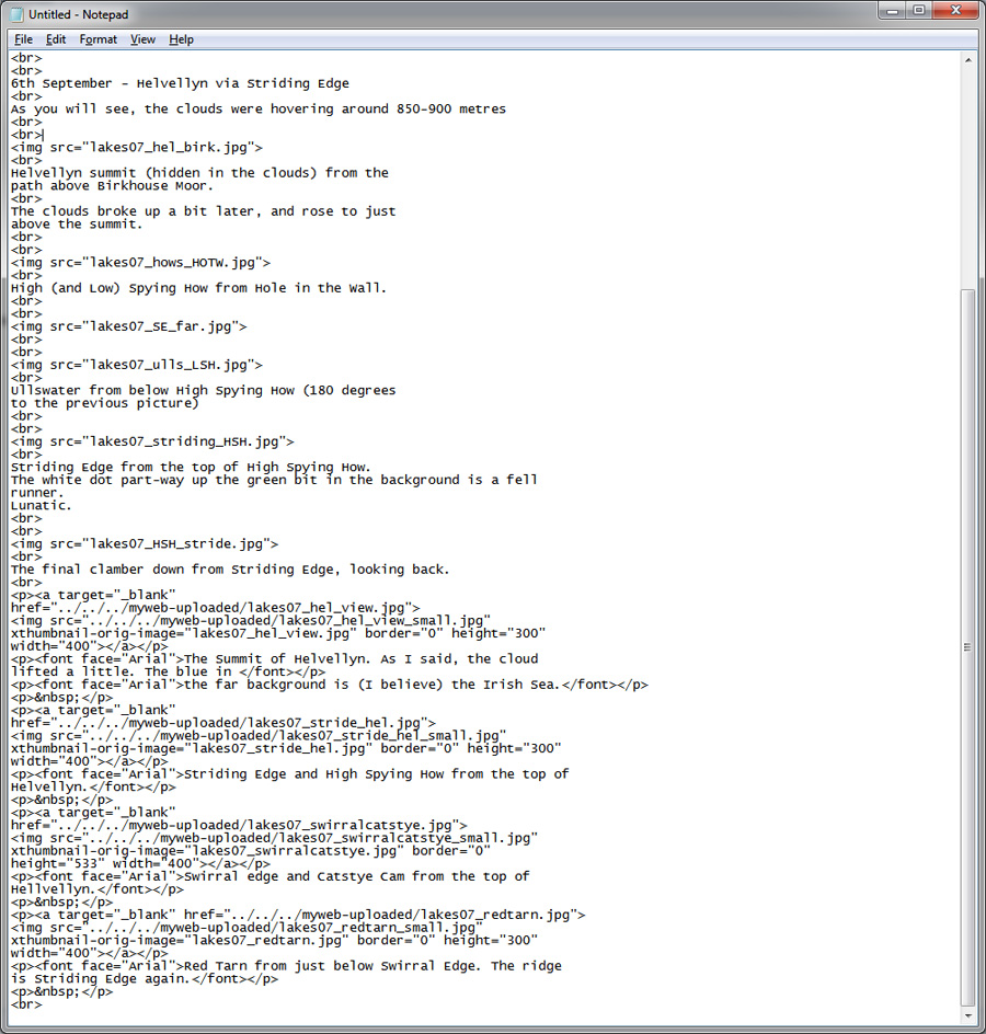
I'm back playing with the website again after a day away at a job interview and a day at the dole office and the cinema (the massively over-rated "Prometheus"). I'm currently moving more of the Lake District pages across from my old site, as mentioned in the 1st June entry below. I've copied another block of HTML to give you a flavour of this a bit better than before:
Even if you're not a coding genius, it should be pretty easy to spot how far along I had got when I did that screen cap. As you may or may not be able to see, this page was originally put up with thumbnails, which means even more code to be removed (the only reason I used thumbnails was to learn how to put them in to web pages). You can also see the way Kompozer changes the links to pictures when you copy and paste. I had copied the code from a directory called "myweb_uploaded", so all the links have been automatically changed to point there. You can then see that I've altered all the links to point to the full-size picture, not the thumbnail, and in the correct directory.
5th June 2012
Today I have learned that you really need to check a page template properly before copying into many different folders under different names. The "Gaming" section of this site has a folder for each of the ten games I plan to talk about. It may acquire more, but it has ten at the moment. As I tend to do, I created a template of what I wanted the page to look like, so that I could check that pages were all in the same style, with the same placing of text etc. I then copied it into each specific game folder, and made a couple of changes to things like the page title on each. But that template itself was taken from the "Software" template, with some bits removed - which is where error crep in. The "Software" page, in common with all "Main" pages, has four "div" sections, for banner, buttons, item list and main body of text. When I cut stuff out of the "Main" template to create the "Gaming" template I removed the item list (because it isn't needed there) and the text, and then saves. But I forgot that there were still four divs, where I needed three. This left the two links and the title in a different div to everything else. This is where playing with HTML is faster and better than using third-party tools: you can cut the block of code you need out of the div it wasn't supposed to be in and paste it into the one it was, and then remove the now-orphan div for the list.I should point out that I settled on this layout when I did the Forensic sections, where were created first. I usually remember to open at least one older equivalent page to check these sort of things, but obviously missed this mistake.
1st June 2012
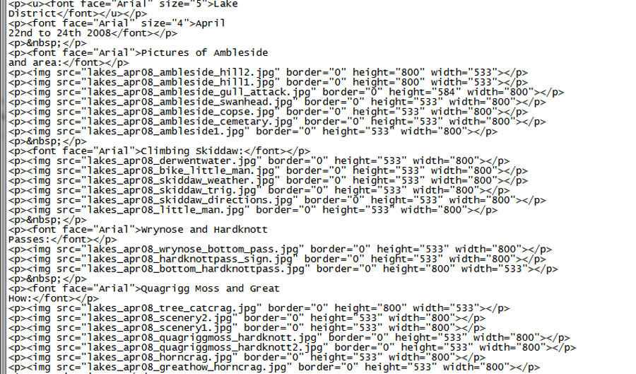
I have started moving all my Lake District stuff from my other site. This is a lot more complicated than it sounds, because I can't just copy all the files to this site and add a couple of links. That site is an old one, originally made in about 2004, and using Microsoft Front Page, meaning a lot of non-kosher HTML. I'm trying to keep this site a lot stricter. Further, that old site does not use CSS, so there is a lot of formatting commands in it. It also contains a lot of photos, which range in size from about 800 x 600 to 1024 x 683. But in the case of this site, I've gone for the almost standard format of fixed 960 pixels wide. Finally, that site has no structure, with everything in the base directory, and this one does have a structure, so many of the links will be wrong.I've managed to get one page across, but it involved a fair amount of work. I started with this one because all the pictures were only 800 pixels wide, so did not need to be shrunk to a width of 900, which will be standard for the site to fit the 960 overall width. Essentially I copied the whole of the body of the page across, minus any header stuff, then went through all the HTML the hard way, correcting it. This mostly involved cutting a lot of stuff out, but a few changes as well: Front Page uses "p /p" a lot and also likes to put pictures in with individually specified sizes etc. Finally, when you copy stuff from one page to another in KompoZer it updates all the links to point to the old location. If you are doing it picture by picture you can stop this, but it's automatic for cases like this. To give you an idea, here is on the original site:

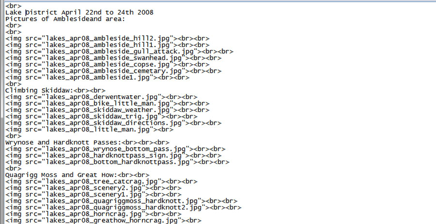
and after bringing it across and editing successfully:

All told, about three quarters of the HTML came out. You will be unsurprised to heear that this first attempt did not work, so I had to do the whole lot again. The second attempt worked pretty much properly, with just a couple of minor tweaks needed. I've also copied all the photos for the other pages across and shrunk them using the batch processing command in Photoshop Elements 9, which saved a lot of time. I had to go back and re-do all the ones in portrait mode because the batch does the shrink using a common width, not a common longest side.
